Why and How To Make Your Website Responsive
If your business relies on a website, you’ve probably heard that it needs to be ‘responsive’ or ‘mobile-friendly’. And we agree. It’s an absolute must these days, for the simple reason that your visibility, traffic and user experience (and therefore your sales and profits) will take a huge hit if your website doesn’t work well across all types of devices.
We’ll explain what a responsive website means, break down some of the specific reasons why it’s important, and start you off with some ways you can ensure your website is mobile-friendly and responsive.
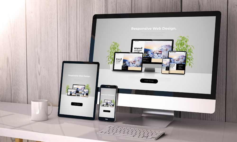
What Does a Responsive Website Mean?
It means that your website will work effectively and look great whether they’re viewed on desktops or on the smaller screens of mobile devices such as smartphones or tablets. The term ‘responsive’ is sometimes used interchangeably with ‘mobile-friendly’, but there’s a difference.
Mobile-friendly websites simply replicate the page as it appears on a desktop, with very slight changes to enable it to work on mobile devices. Responsive websites, however, are more complex and fluid, changing as they ‘respond’ to different screen sizes.
The layout and elements are dynamic, so the site’s content adapts to fit the size of the screen while retaining a clean and professional look. For example, a 3-column layout on a desktop may change to a single-column display on a phone, and menus will be condensed into dropdown ‘burger’ menus.
Also, text and buttons are enlarged so they’re easier to see and press on touchscreens. And some features can be simplified so they load quickly on smaller devices with less processing power.
Why Is it Important to Have a Responsive Website?
As we’ve mentioned, if your website’s not responsive, you’re going to lose out on a lot of traffic (and a lot of income if you rely on it for business).
Here’s why:
A Better User Experience Keeps People on Your Site
Imagine opening up a site on your smartphone or tablet, only to find that it takes forever to load. Not only that, things aren’t displayed properly so you have to scroll around to see everything. What’s more, the text is so tiny that you have to keep pinching the screen to zoom in and out, and you keep clicking the wrong links.
It’s just not worth the hassle is it? By now, you’re so frustrated you probably can’t even remember what you were looking for. Won’t be visiting that site again.
You don’t want people to have that experience on your website. People are impatient these days, and almost 40% of them will leave your page if it takes longer than 5 seconds to load.
A responsive design ensures the website loads quickly and looks great on any device, with everything easily accessible. Keeping the user experience as smooth as possible is going to keep people on your site for longer and encourage them to return.
It Streamlines Your Sales Funnel
People aren’t just browsing more on their mobile devices – they’re increasingly using them for online shopping. So if your business relies on its website for sales, you need people to be able to glide through your sales funnel with as little friction as possible, whatever device they’re using.
Not only will a responsive website enable this, but you can even optimise your website to convert sales on mobile devices, such as by using buttons that link directly to a phone’s call function.
Search Engines Reward You
It’s official – Google prefers responsive web pages. Not only are they easier for search engines to crawl, but Google knows modern users expect websites to work effectively on any device.
So ensuring your website is responsive will help to push you up the search rankings, leading to more traffic.
Mobile Is the Future
Over 50% of web traffic occurs through mobile devices, and that figure is only likely to grow. While the exact proportion of traffic that comes from mobile devices will vary depending on your sector, it’s sure to represent a hefty chunk of your audience.
Can you really afford to risk the possibility of excluding that amount of people because your website doesn’t work well on mobile devices?
It Contributes To a Modern, Professional Image
If nothing else, a poorly-functioning website just rubs off badly on your brand. A website that’s slick and attractive on any device shows your audience that you’re up-to-date, efficient and care about their experience.
You Won’t Fall Behind Your Competition
If you don’t embrace the trend towards mobile browsing, your competitors sure will. People won’t stick around if they’re struggling to access your site on a mobile device.
They’ll simply find another one that works well, and that’s where they’ll spend their time and money (even if your products and services are better).
Hopefully, these reasons have shown you why having a responsive website is a necessity these days. But how do you get one?
How To Get a Responsive Website
You can find out if you’ve got a website that works well on mobile with two easy methods:
- Simply visit your site on a mobile device and make a few observations. Does it load quickly? Is it easy to navigate? Is everything the right size relative to the screen?
- Run your website’s URL through Google’s Mobile-Friendly Test tool. It’ll take a minute or two to crawl your site and tell you whether or your not your site is working well on mobile devices.
But what’s next if you find out it isn’t? How can you get a responsive website? The answer depends on your level of expertise.
Using HTML and CSS
If you’re confident using code to develop your site, there are some methods you can use to improve the responsiveness, such as:
- Adding a viewport meta tag to the page header that instructs the page to match the screen size
- Setting column widths as percentages of the containing grid, so they don’t exceed the page size (known as a flexible grid)
- Use a mobile-first approach, optimising your page for smaller screens and then adapting it for larger ones.
- Don’t allow pop-up ads. These are particularly intrusive on smaller screens and many users will just exit the page.
Using a Drag-and-Drop Theme
If you develop your own website and the thought of using code fills you with terror, don’t fret. If you use a content managing system like WordPress, there are tonnes of themes out there that provide foolproof drag-and-drop web-building tools.
And the best thing is that most of these are programmed to automatically make your website responsive. Some even have a ‘responsive mode’ that lets you change the view as you are building it, to see how it will look on different-sized screens.
Get Professional Help
If that still sounds too much like hard work, you can always pay a professional web design team (ahem, that’s us) to build you a sleek and responsive website that suits your needs.
Get in touch to chat about how we can get your website up to date.